


1
2
3
4
5
6
7
8

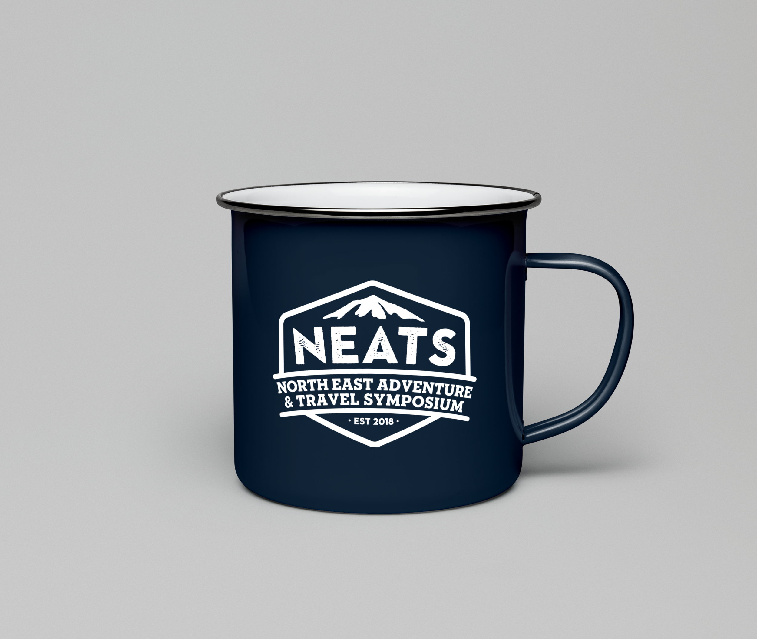
My goal was to create a logo that was unique yet representative of the adventure recreation, trip programming and risk assessment focus of the conference. With the event being fairly new, a polished and professional identity is important to establish trust and credibility, while maintaining an approachable, genuine and adventurous appearance. The textured sans serif font creates a stable and robust image, especially when paired with the secondary slab serif font. The badge shape is indicative of the camping field and is highly recognizable. By pairing it with a less traditional color palette the badge sets itself apart from other logos in this industry.